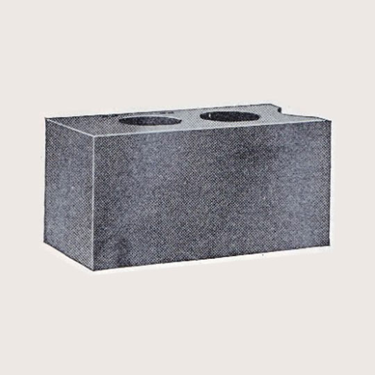
 Design No. 4
Plain Face
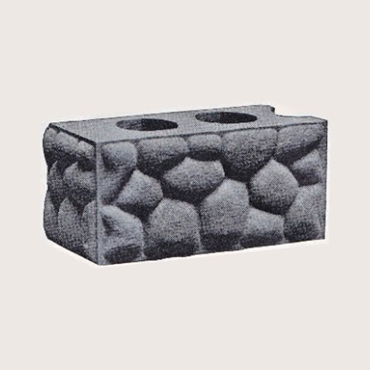 Design No. 5
Cobblestone
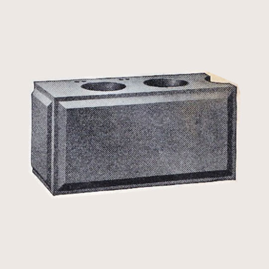 Design No. 6
Panel Face
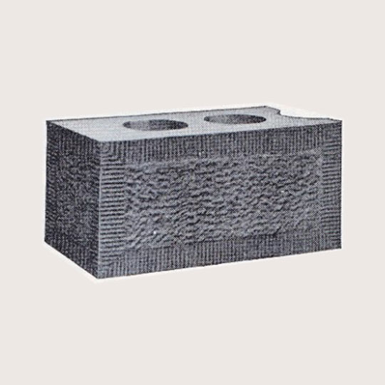
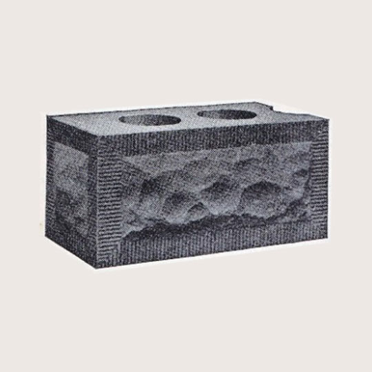 Design No. 7
Rock Face
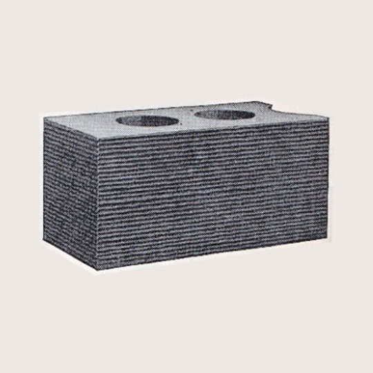
 Design No. 8
Bushhammer
 Design No. 9
Horizontal
Grid · Flexbox · Responsive Design
grid-column: 1 / -1Defined with grid-template-columns: 200px 1fr and grid-template-rows: auto 1fr auto. The 1fr unit takes all remaining space.
Design No. 4Design No. 5Design No. 6Design No. 7Design No. 8Design No. 9Can be furnished in all Divisions. But one endgate needed.
A fine above-ground foundation block. 16-inch plate not made in Division D.
16-inch plate not made in Division D. But one endgate needed.
With 1½-inch tooled edge. Not made in Divisions C and D.
With 1½-inch tooled edge. Division F not made in any size.
But one endgate needed. Consistent horizontal finish.
Grid for the page, Flexbox for this row of cards:
Taken from the Sears, Roebuck and Co., Chicago
Can be furnished in all Divisions. But one endgate needed.
A fine above-ground foundation block. 16-inch plate not made in Division D.
16-inch plate not made in Division D. But one endgate needed.
With 1½-inch tooled edge. Not made in Divisions C and D.
With 1½-inch tooled edge. Division F not made in any size.
But one endgate needed.